Pages

Tuesday, June 29, 2010

Tuesday Trigger from Moxie Fab World


This is the gorgeous image that Kath chose this week for her Tuesday Trigger challenge.  If you know me, you know that I take things literally, so here is my take on it. 


I substituted a coffee mug because that is usually one of the first things I grab when I bring in a few flowers from the garden, but otherwise I followed the picture pretty closely, using the same colors.  I needed a small sentiment, since the mug with the flowers took up a good part of the space, and decided to use this one from PTI, and added some faint script in the background to follow through.  The background was distressed using brown and a bit of orange inks

Supplies: My Time Made Easy "A Spot of Tea" stamp (teacup), Hero Arts CG108 Special Moments (rose and leaves), LP123 Artistic Windows (script), PTI Vintage Picnic Sentiments, 2 pink, cream, and green cardstocks, papers from K&Co. Designer Mat Pads, Bailey and Hopscotch Girl, Versafine onyx black ink, Palette Burnt Umber, spiced marmalade distress inks, rose petals from a silk flower

Monday, June 28, 2010

PDCC #35


This week's colors at the Play Date Cafe are brown, turquoise, orange and red; see the inspiration picture below.  I used all printed papers for my elements except for the butterflies, the red frame, and the kraft card. 

Supplies: Crafty Individuals poppy stamp C95.210L, Hero Arts CG119 Flourish Background, CL266 Mix & Match (sentiment), digitally resized Heart Winged Butterfly F5158, Memories Artprint brown ink, orange and black gems

Sunday, June 27, 2010

Stamping with Markers

I just received this big Hero Arts cling set called Wildflower Garden.  Since it's such a simple design, and easy to color, I decided to do both designs in the set using markers instead of ink.  Both were spritzed before stamping with a mixture of perfect pearls and water, which softens the colors and gives a nice watercolor effect. 
I've used Marvy markers, and I had plenty of time to get all the colors on the stamp without them drying out.  I didn't add any embellishments except the sentiments.....makes for a really easy and fast card.


Supplies: Hero Arts CG1170 Wildflower Garden, unknown clear "Smile", PTI Vintage Baskets sentiments, Marvy Markers, white cardstock, HA mandarin notecard, nestabilities labels one, spiced marmalade distress ink (background on mandarine card), Versafine onyx black (sentiment on sunflower card)

Friday, June 25, 2010

Just because

Just a quick post.....This Hero Arts Dogwood stamp is really a beautiful image.  I haven't played with it near enough.  I started by stamping it twice on white cardstock, once in soft blossom shadow ink and again in peeled paint distress ink.  After cutting out the pink blossoms and distressing around the edges with fired brick, I curled them a bit, and popped them above the green image, adding some seed pearls to their centers.  I thought it would look good with Tim Holtz's birdcage and bird, but until today, it just wasn't coming together.  This afternoon I decided to try stamping the dogwood a few times as a background in peeled paint distress ink, and now I'm happy with this result.  The sentiment is from PTI's Vintage Picnic Sentiments.  Thanks so much for looking, and I hope you have a great weekend.

Monday, June 21, 2010

Color Layering

This month, one of the challenges at Hero Arts is color layering.  I have really struggled with this, and am not even sure if this qualifies, but I am happy with my results.  Since embossing is a big part of this design, I'm also entering it into this month's Caardvark's challenge.  I was heavily influenced by this gorgeous card of Kathy's, and she in turn was inspired by Carole.  Aren't they gorgeous?  Here is my take. I decided to use mostly blues, with some greens and browns.


The circle doily is on loan from my friend Carol, and the beaded butterfly is made by my friend Yvonne. 


Supplies: CG168 Circle Doily, LL040 Woodland Ferns, CL383 Antique Engravings, H2141 Manuscript Background, CL129 Anytime Messages, white and beige cardstock, Adirondack stonewashed, vintage photo, peeled paint, and faded jeans distress inks, versamark ink and white embossing powder, pale blue sheer ribbon

Papertrey Ink stamps

Thanks to Vanessa, I now have some PTI stamps! (I won some blog candy from Vanessa). Here are the cards I made to say thanks to her, using my new stamps.

This first one uses a Year of Flowers stamp called Violet.  This is the biggest image in the set.  I stamped it twice on iris and a gold cardstock, then overstamped a tone-on-tone antique flower image before reconstructing the pansy.  This pairs up nicely with my Martha Stewart pansy punch.

Supplies: PTI Year of Flowers - Violet,  HA S5264 Antique Flower Background, CL341 Thank You Sayings, Martha Stewart pansy border punch, Cuttlebug swiss dots embossing folder, iris, gold, white, green cardstock,  iris chalk ink, Versafine onyx black ink, mustard seed distress ink, purple colored pencil, gold pearls

This set is called Vintage Picnic, and I have been wanting it for a long time!  Thank you, Vanessa for enabling me!  It has 5 different baskets, plus the little plaid liner cloth, and oodles of fillers and sayings to coordinate.  (I also got the accompanying sentiments stamps to make it even more versatile.) This filler was a bunch of tulips, which I covered with tiny heart buttons. 

Supplies: PTI Vintage Picnic, Vintage Picnic Sentiments, nestabilities ovals, Martha Stewart butterfly bunch, heart buttons, BoBunny dotted papers, white and kraft cardstocks, colored pencils

My parents will be visiting for a few days this week, so I will be scarce for awhile.  Have a great week, everyone, and, as always, thanks so much for your lovely comments.  Today is the longest day of the year - enjoy!!

Saturday, June 19, 2010

Vellum Flowers

Since these cards use both wet and dry embossing, I'm entering them into Caardvark's monthly challenge.
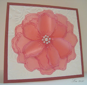
This is another of my new stamps from Hero Arts, called Stencil Flower.  After seeing all the lovely things that Heather did with a similar large flower stamp, this one was on my list of wants from the newest catalog.   Here I stamped it twice on a printed vellum, and heat embossed it with white.  I trimmed out a top layer, curled the petals a bit, added some pink pearls to the center and layered it over the full image.  I decided to layer that over an embossed pearlized pink panel, then onto a white card.


Here is a close-up detail.


And for my second try, I used a pearlized pink vellum, following the same steps I did above, but using Iris chalk ink and clear embossing.  The background is a Cuttlebug folder called Victoria, and that panel was layered onto a dark lilac card.

Baskets

I got some new Hero Arts stamps yesterday!  This Sunny Smiles basket set was one of the tops on my list, and it is the first one I'm playing with.  For this first one, I just stamped the flowers right onto the die-cut circle, colored them in, adding some tiny gems in the center of the daisy-like flowers, stamped the sentiment in a semi-circle, then stamped and cut out the basket on kraft paper and glued it over the flowers. 

Supplies: CG199 Sunny Smiles, CL342 Everyday Sayings, Nestabilities Scalloped Circle and Circle diecuts, colored pencils

And for this one, I decided to add some strawberries to the basket, and a little blue lacy liner.

Supplies: CG199 Sunny Smiles, S5101 Raindrop Background, CL320 SparkleClear Designer Fruit, BoBunny Back to Basics paper,  white, blue, and red cardstock, Adirondack Stonewashed and Versafine onyx black inks, green colored pencil

And for the final one, I used the flowers again and one of my favorite color combinations, blue and yellow.

Supplies: CG199 Sunny Smiles, CL342 Everyday Sayings, Martha Stewart pansy border punch, yellow and white cardstock, Bazzill dotted blue cardstock, colored pencils, blue and white pearls

Friday, June 18, 2010

{Embellish} baby challenge

The current challenge at {Embellish Magazine} is to make something with a baby theme and use these colors - I love them!!  So springy, and they would work for either sex!    Here is my take:


Supplies: various peach, yellow and green papers, ivory cardstock, Hero Arts stamps CL155 Playful Animals, CL264 Precious Baby, Sizzix embossing folder, Nestabilities Labels Eight

Play Date Cafe Challenge #34

This is the first Color Splash challenge I've done, and I really enjoyed this - what a great effect!  And you all know how I love my blues!!  Here is my entry:


I was inspired by KathyC's quilt card; I really like the strips of black and white, and thought they'd work beautifully for this challenge.  So I cut strips of black and white cardstock, then stamped a variety of Hero Arts background stamps for the varied patterns.  My butterfly was stamped on a piece of polished stone paper from my scrapbasket, and I gave it blue antennae and a blue trail. 

This is such a fun idea!  Go and look at all the other wonderful entries at the Play Date Cafe!

Supplies: Hero Arts F5158 Heart Winged Butterfly, CL307 SparkleClear Mini Messages, S5341 Lace Background, CG125 Friend Definition, K5175 Houndstooth, CG119 Flourish Background, S5264 Antique Flower Background, CG118 Stripes Pattern, Nestabilities Labels Eight, Cuttlebug Textiles embossing folder, blue wire, blue pearls

Thursday, June 17, 2010

{Embellish Magazine} Color Challenge with Labels, take 2

These colors from the {Embellish Magazine} color challenge are so lovely together, I wanted to try another card using them.  I am getting in just under the wire!


Supplies: Hero Arts AR137 Script Messages, Waltzing Mouse Very Vintage Labels #4, Nestabilities Labels Four, yellow, coral, brown cardstock, Petite Pink Posies designer paper, Cuttlebug Textile embossing folder, Memories Art print brown ink, clear embossing powder, coral ribbon, K&Company Susan Winget Grand Adhesions butterfly

ColourQ challenge #37

Thanks to Rosemary (look at her GORGEOUS card for this challenge), I found a new color challenge at ColourQ #37, and she's right, the color combination is yummy! Here's my take:


Supplies: HA CG148 Blossoms, CL380 Truly Appreciated, Punch notecard, soft shadow apricot ink, apricot pearls, BoBunny coral dot dp, PTI button, Sizzix embossing folder, Martha Steward pansy border punch, apricot embroidery floss

Wednesday, June 16, 2010

Salt Glaze Stoneware

I have always been drawn to the grey pottery with blue designs known as salt glaze pottery, maybe because of the blue designs. The pieces are made by wheel turning or hand building, and the decorative designs are hand applied by slip trailing or brushing. As they are baked in a kiln, salt is introduced at a very high temperature, and this produces a glassy, pebbley coating on the pottery. Here are some pieces from my collection.  It comes from all over the eastern and mid-western United States, (Beaumont from York, Maine, Rowe and Wisconsin Potteries from Wisconsin) and has been collected as we have travelled, although we had a potter here in an adjacent town (Stebner Pottery from Hartville, OH).  Does anyone recognize these potters? All are new pieces.  And yes, I do use them.


Today I saw this gorgeous card made by Leni.  I dropped everything to see if I could make my own version, substituting a stoneware crock for her bucket.  Here is my card. 


I hand-drew the shape of the crock onto grey cardstock, then used these little flowers from a Hero Arts sentiment set to simulate the designs often seen on this kind of pottery, shading it with grey and brown inks.  Then I stamped and colored 3 hydrangeas and added them to the pot.  I'm really pleased with my approximation of these treasures!  And thank you, Leni, for your inspiration - I spent a very happy couple of hours putting this together!

Supplies: HA stamps K5376 Hydrangea, CL380 Truly Appreciated (floral design on pot), CL371 Essential Messages for sentiment, CG125 Friend Definition, grey, white, pale and dark blue cardstocks, colored pencils, Adirondack Denim dye ink, Stampology Onyx ink, Palette Burnt Umber ink,  Nesties Labels Eight

Tuesday, June 15, 2010

Vellum Violet


I was lucky enough to win Vanessa's blogcandy recently, a gift certificate to Papertrey Ink.  I love their designs, and this pushed me over the edge to place an order.  This "Year of Flowers: Violets" set was one of many on my list.  After receiving my order, I was even more impressed with this company!  The stamps are top-quality clear ones, packaged and presented beautifully!  Here is one of my first plays with this lovely set. 
I knew I wanted to try stamping on vellum, and when I saw this lovely creation by Jess over at the Hero Arts Flickr community I got my inspiration to put it over the big cling flourish background.  Then this card took on a life of its own.  The panel there is the top of a sheet of 20 postage stamps that I have been loving since they came out in April or so this year.  Then I just added some sheer dotted ribbon on either side.

Supplies: PTI Year of Flowers: Violet, vellum, VersaMark ink and white embossing powder, lavender pearls, HA Hero Hues Iris Layering Paper, HA CG119 Flourish Background, Iris chalk ink, lavender dotted sheer ribbon.

Monday, June 14, 2010

Embellish Magazine challenge using labels

Embellish Magazine has challenged us to use these 3 colors and a label. 

Here is my take:


Supplies: Hero Arts CL374 Big and Small Flowers, CL130 Frames and Messages, BoBunny Flamingo Double Dot and Mellow Yellow Dot, coral, brown cardstock, Memories ArtPrint Brown ink, coral and yellow PTI buttons, coral and yellow embroidery floss, Cuttlebug D'vine Swirls embossing folder

Another stitched card


Here's another entry into Jenny's current challenge, to use stitching of any kind in a card.  I zig-zagged around the white panel with my machine, and the stamp itself is made to look like it's stitched.  Added a garland of buttons to go along with the theme, and used the tabbed sentiment again from the Taylored Expressions challenge. 

Supplies: HeroArts H4063 Stitched Flower Trio, CL307 Mini Messages, Melody Ross Petite Floral designer paper, white and gold cardstock, versafine onyx black ink, colored pencils, assorted buttons, green embroidery floss

Sunday, June 13, 2010

In Stitches


At Jenny's blog this week, she has challenged us to make something using stitching, either for real or faux.  That reminded me of a tutorial  to make a quilt card that my friend Carol pointed me towards.  Here is my entry for Jenny's challenge. I really like the way it turned out, especially how the embossing makes it look like a quilt!  I used a variety of brightly colored designer papers, using aqua, bright pink, green and yellow, incorporating dots, ginghams, stripes, and some little prints.  I followed the tutorial, but before cutting out the shape with my nestie labels eight die, I took it to my sewing machine and zig-zagged all along the seams between the pieces.  I embellished my card with paper-pieced sewing tools, from my new Hero Arts set Sew Original.  The sentiment is from another little HA SparkleClear set that Virginia sent me last year.

Supplies: HA stamps CL397 SparkleClear Sew Original, CL188 Tea, Spellbinders Nestabilities Labels Eight, Cuttlebug Textile embossing folder,  various designer papers, white cardstock 

Taylored Expressions Challenge #117

Taylored Expressions is a new challenge for me; I found this one at Alice's blog, and loved the little sentiment tab on the side. Here is the current sketch:


And here is my take on it:


Supplies: HA H2975 Posy Sketch, paper-piecing the vase and using colored pencils for the flowers and leaves, F3343 Gingham Ribbon, stamped because I couldn't fine the right color of real ribbon, PTI sentiment from Vintage Picnic Sentiments, BoBunny Buttercup Dot, Bazzill Mini Scalloped Slate Blue, The Paper Company Primary Blue, unknown white cardstocks, Mark Richards Crystal Stickers white cabochons

Thursday, June 10, 2010

Simplicity


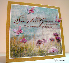
This is my 2nd entry made for the Play Date Cafe Challenge #33, to use raspberry, aqua, kraft, and white (you can see them on the post below this one).  I feel like I'm cheating, using this beautiful Vinnie Pearce digital paper and butterflies, but the colors were too perfect to pass up!  I simply reduced them and printed them out onto a textured white cardstock, to make it look more painterly.  Then I stamped the sentiment, cut out and popped the butterflies, and added some pearls and gems.

Play Date Cafe Challenge #33

At the Play Date Cafe Challenge, the colors are raspberry, aqua, kraft and white.  Here is my take on them:


I recently won a set of clear stamps from Lauren at My Time Made Easy in a random draw.  They are Catherine Doucette's first designs, and I was lucky enough to win the set!  Take a look at it here; there are lots of fun images, all built around a tea theme.  LOVE the tea cup, so many ways to stamp it!
When I saw the challenge colors, my mind jumped to the new Lucy Bird paper I just got, and I thought it would be great to piece the cup. 

Supplies: My Time Made Easy clear set A Spot of Tea, Hero Arts CG118 Stripes Pattern, kraft, white, aqua cardstock, broken china distress ink, VersaFine Onyx Black ink, imaginisce Lucy Bird and BoBunny Blush Dot papers

A boy and a dog


Just sharing another picture from last weekend........my parents' mini dachshund Heidi meets Liam.  Delight on both sides! 

Lucy's Challenge #11


Lucy's challenge this time is to use the colors of white, light blue, and light kraft, and birds if we can. Great fun colors. Here is her inspiration:


Here is my entry:


Supplies: Labels One Nestabilities,  Inkadinkado Birds Galore #97548, Hero Arts CL169 Happy Day Floral, S5264 Antique Flower Background, S4878 Old Letter Writing, blue, white beige cardstock, Robin's Egg Blue and Sepia inks, twine, pearl

Wednesday, June 9, 2010

A joyous time


This is a big year in our family: my Dad celebrated his 90th birthday on May 22, and he and my Mom will celebrate their 65th anniversary on June 23.  We had a party to mark both occasions last Saturday, and it was extra special because this was the first time they had met our grandson, their great-grandson, Liam.  And as a topper on the cake, Liam took his first steps alone at the party!  Could my smile be any bigger?  We had both of our sons, my dil, Liam, and almost all of my family there, including my 88 and 93 year old Aunts!  I'm having a little trouble coming back down to earth now ........

Wednesday, June 2, 2010

Here comes summer!


I can't believe June is here already!  So I thought it was time to change up my blog again; this background and header is one of several that I really like made by Ingrid

One symbol of summer for me is sunflowers, and so I decided to make a sunflower card to welcome summer, following a sketch that Shari shared with us at the Hero Blog.  Though the calender doesn't say summer quite yet, the weather here surely does; we've been having highs in the 80's, and you can see things growing! 

Supplies: Hero Arts stamps CL426, CL266, CL137, S5101, BoBunny orange citrus dot, Bazill gold dotted cardstock, white cardstock, spiced marmalade, mustard seed, scattered straw, vintage photo distress inks, Hero Arts soft apricot shadow ink, VersaMagic Mango Madness, Versacolor Marigold, Adirondack Sunset Orange, assorted paper flowers, Making Memories velvet brads (thanks, Mary Anne!)