Pages

Thursday, March 31, 2011

Welcome to the Lily Pad Cards Blog Hop!

                                                      
Welcome to stop #28, the final stop on day 4 of the Lily Pad Cards Blog Hop!  Lily Pad Cards is a new challenge blog that will feature interviews, articles, videos, challenges, great prizes, and more!

You should have arrived here from sweet Ashley's blog.  The Hop features 7 blogs each day.  It started Monday, March 27 and will finish tomorrow, Friday, April 1, with the grand opening of Lily Pad Cards!  Although Lily Pad doesn’t officially open until tomorrow, you’ll be able to see a new sneak peek every day until then. And there are three prize packages with a total retail value of over $800 - including a $100 gift certificate to a very popular online store! Go here for specific prize details and contest rules.

Our Hop’s theme is "Welcome" because we are welcoming Lily Pad Cards to the neighborhood, and we’re also welcoming all of you to come and join in all the fun!  I am so honored to be a member of the Design Team of Lily Pad Cards, and to get to work with the other amazingly talented design team members!

Here is my first Welcome card for you all:


supplies: white cardstock, Hero Arts CG215 Wreath of Leaves, peeled paint and shabby shutters distress inks, 3 different shades of pink BoBunny dotted papers (Tutu, Passion Fruit and Blush), and reverse of Avocado Dot, Die-namics die-cut rolled roses, Really Reasonable Ribbon dotted grosgrain ribbon, Hero Arts CH173 Hearts Accent Pearls, computer generated sentiment using "Old Script" font

While I was at it, I made you another version, just changing up a few elements:


supplies: white. aqua and green cardstock, Hero Arts CG215 Wreath of Leaves, peeled paint and shabby shutters distress inks, digital bird from Grapics Fairy, Inkadinkado #97194 Nest, watercolor pencils, computer-generated sentiment (Old Script font), hand-dyed seam binding, faded jeans distress ink, Hero Arts CH165, white Art Flower, the Paper Studio flower brad

In thinking about the theme, my mind went to the wreaths that I hang on our front door and change with the seasons - it is my way of saying welcome to my friends when they come to visit.  Thank you so much for visiting me today! 

Tomorrow at 9:00 am EST, you can start the Hop again at the Penny Black Blog, and if you follow along you'll end up at the brand new Lily Pad Cards Blog as it officially opens!  If you hit a bad link, you can always go to Lily Pad Cards  and click on the next link in the hop. Please report any bad links to webmaster@inlinkz.com.  Happy Hopping!

Wednesday, March 30, 2011

90 Minute Scramble, Monday, March 28

About every 2 weeks or so, over at the Hero Arts flickr group, we have a competition.  The hostess gives us a challenge, in this case, to make a window card, and then we have 90 minutes to make something using that criterion and using at least 1 Hero Arts stamp, take a photo of it, and get it posted to the gallery.  This time I got in just under the wire!  Here is my submission:


For my window I used a Dienamics rolled rose die.  And the cutout that resulted was made into the rose centering the stamped flower.  I placed the window to take out most of the bird on the big background Musical Collage stamp and used my leaves to cover up what was remaining of the bird's tail and the branch. The leaves also hold up the stamped flower from the inside of the card. I placed a white square inside the card to contrast against the front of the card and the flower.


supplies: aqua, green and white cardstock, S5501 Musical Collage, stamped in Versamark and white embossed, CG119 Flourish Background, stamped in Hero Hues Cerulean ink, CL322 Artistic Borders (flower), CG291 Three Dotted Flowers (leaves), CL497 Find Joy, Dienamics large rolled rose die

I encourage you to look at the link above to see lots more examples of window cards.  And here is the schedule for upcoming scrambles - the next one will be April 16, hosted by Sally.

Tuesday, March 29, 2011

Garnet, chartreuse, and cream

Here is the inspiration photo for this week's CR84FN challenge:


Here's my entry, stamped using markers:

supplies: chartreuse and garnet cardstocks, ledger dp from Brenda Walton "Flora & Fauna Ledger" K&Company matpad, Hero Arts CG170 Wildflower Garden, stamped in Hero Hues Rhubarb Stalk and Bamboo Leaves dual-tip markers, Martha Stewart double loop edge punch, bubble sentiment a gift from Savannah, chartreuse ribbon

Monday, March 28, 2011

Spring Flower Palette

This week's Shabby Tea Room challenge is to use this inspiration picture and flowers:


I chose to use the soft pastel colors from the inspiration.


supplies: green and white cardstock, Hero Arts S5341 Lace Background, versamark and white embossing powder, CL488 Congrats, CL490 Sending Smiles, versafine onyx black ink, BoBunny buttercup dot cardstock and Martha Stewart butterfly punches, tiny buttons and pearls, Recollections Boutique Fleur flowers, white seam binding

Welcome Lily Pad Cards Blog!


Just in case you've missed it, there's a new card challenge blog starting and it's launching with a week-long Blog Hop, starting today!  Click here to start - I hear there are some nice prizes involved!

Please check back here on Thursday at 9 am to see my contribution!

Sunday, March 27, 2011

More paper play

Still playing with some new little K&Company mat pads, from Susan Winget and Tim Coffey.


The main flower panel and the little butterflies are from Susan Winget's Spring Blossom mat pad, and the striped background is from Tim Coffey's Cottage Garden mat pad.  I just added a doily and some hand-dyed seam binding, and cut out the little butterflies as embellies.  What an easy card and I know it will bring a smile to someone's face!

supplies:  pale pink cardbase, K&Company 4.75 X 6.75 mat pads, Hero Arts CL173 SparkleClear Simple Messages, hand-dyed seam binding form Donna, paper doily

Saturday, March 26, 2011

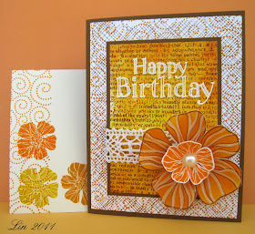
Sunny Birthday card


supplies:  white and brown cardstock, Hero Arts stamps CL494 Hip Hip Hooray (sentiment), versamark and white embossing powder, CG125 Friend Definition, CG211 Magical Background, S5507 Envelope Pattern, CL495 Blossom Art, mustard seed, wild honey, spiced marmalade and vintage photo distress inks, lace, large pearl

Here's a card I made to enter into this month's challenge at the Hero Arts Blog.  We have 3 options: to make a birthday card, decorate an envelope, or use a background stamping technique.  I tried to do them all with my entry. 

Starting with a piece of white cardstock, I white embossed the "Happy Birthday" greeting.  Then I inked an acrylic block with mustard seed, wild honey and spiced marmalade distress inks, spritzed with water, and stamped that over my greeting.  After that was dry I overstamped the Friend Definition in vintage photo distress ink and then the Magical Background in spiced marmalade.  That panel was then trimmed and framed in brown cardstock.  Next I stamped a card-size white piece of cardstock in the same inks using the Envelope Pattern and the Magical Background again, and glued that to a brown card base.  Lastly I stamped the large flower using Memories Art Print brown, and sponged on some wild honey distress ink, then used orange and white colored pencils to give it more definition.  The smaller flower was stamped on white using spiced marmalade distress ink.  I finished with a piece of white lace from Carole, and a large white pearl from Virginia.

Before I go, I thought I'd give you a gentle reminder to check out Vicky's blog on Monday at 9:00 AM EST - you wouldn't want to miss what she will be starting........I'm just sayin'........

Friday, March 25, 2011

Play Date Cafe #74

Here's my submission for this week's Play Date Cafe challenge, using the inspiration picture you'll see below it:


supplies:  turquoise, purple, and white cardstock, PSX stamp K-1695 from 1995, a gift from a friend, Hero Arts CL490 Sending Smiles Messages, Versafine onyx black, watercolor pencils, lace from Carole

Once, again PDCC has surprised me with some colors I wouldn't probably have tried on my own.  The inspriration picture made me think of a cottage in the French countryside, so I added the little bit of crochet lace to represent lacey curtains in my imaginary cottage.

CASE Study #32

Here is my CASE of Julee Tilman's gorgeous card for CASE Study this week. 


These gorgeous papers are all from a K&Company Tim Coffey designer mat pad. I adore these blues, and chose 3 of the papers for my card.

supplies: blue and green cardstocks for card base and framng panels, K&Company Tim Coffey "Cottage Garden" mat pad, Nesties Labels Four, Hero Arts CL169 SparkleClear Sending Happy Thoughts, hand-dyed seam binding, pearls, bit of doily lace at corner

Here is the gorgeous card by Julee Tilman that we are to CASE this week at CASE Study.  I love everything about it, the sketch, the colors, all the elements.

Wednesday, March 23, 2011

Trying a new technique

My friend Yvonne sent me this link to a technique using embossing folders and wax paper.  I was intrigued and gave it a try and here is my first result.  I think it gives a kind of lacey effect:


In short, you stamp an image on white cardstock.  I colored mine using watercolor pencils.  Next you run a piece of wax paper through an embossing folder, then place it over the stamped cardstock, cover that with a piece of scrappaper above and below (to protect your iron from wax) and then iron over it using your hottest setting and no water in the iron.  Discard the wax paper, then, rub an ink directly onto the cardstock.  I used tumbled glass, first using a sponge tool, but at the end rubbing the ink pad directly on the cardstock.  Quickly use a paper towel to remove any extra ink, and the pattern begins to pop out - one of those magic moments!   I went back in and used some markers to bring my flower and leaves back out, as they were a bit muddied from the blue ink.  The finished panel was cut with a nesties label die, framed in pale pink, and then centered over aqua paper embossed with the same folder, adding my sentiment and a pale pink ribbon.

This was fun, and I'll try it again!  Thanks, Yvonne!

supplies:  white, aqua and pale pink parchment cardstock, Penny Black 4036K Poppy Poem, Hero Arts CL367 Card Messages, versafine onyx black ink, Cuttlebug Textile embossing folder, tumbled glass distress ink, Nesties Labels Four, pale pink ribbon

Tuesday, March 22, 2011

Citrus Smiles

Here's our Tuesday Trigger at Moxie Fab World this time:


I LOVE it -these colors are the epitome of Florida to me.  Today I was replenishing my supply of BoBunny dotty papers, and 2 of the 3 colors here were part of my purchase...... came home and found the challenge, so I was all ready to go.  I decided to ink up a stamp I haven't used yet and here is my card:


After the houses were stamped and pieced and lined up, I thought they looked like faces smiling at me, so this sentiment seemed just right.

supplies: white cardbase, BoBunny Back to Basics cardstock in Orange Citrus Dot, Kiwi Double Dot, and Buttercup Dot, Hero Arts CG182 Two Houses, CL267 Card Messages, versafine onyx black ink, tiny green gemstones for doorknobs

March Card Chain

For over a year now, Deborah has been organizing us in a card chain - you sign up each month, and then make a card for someone, and receive a card from someone else!  Deborah gives us a sketch, a color palette, and some themes, or we can go out on our own and just make what we'd like.  This month I received this gorgeous spring beauty from Clare:


Isn't it exactly right for this time of year?  So sweet!  And here's the one I sent to Sheila, following the sketch and using most of the suggested colors:


This month we had 58 participants!!  If you'd like to join in the fun, just check Deborah's Blog about the 25th of the month onward, and she'll have a sign-up post.

Monday, March 21, 2011

Bingo!

Here's a fun challenge this week at the Shabby Tea Room.  Using this inspiration board, we are to choose any three in a row embellishments to create a card:


AND, if we can get all 9 of these onto a card, we will be entered into a random draw for 5 yards of hand-dyed seam binding from Debbie's Etsy shop!  So that's what I aimed for, and here is my card:


The pink card is dry-embossed, I used real lace and a border punch, 1 paper flower, 1 brad at its center, pearls, buttons, and an aqua ribbon.  The glitter is part of the die-cut image I used as my main image, see detail below:


supplies: Hero Hues carnation layering paper as cardbase, sizzix embossing folder, die-cut from K&Company Susan Winget Spring Blossom Seed Packet package, Martha Stewart doily border punch, dotted satin aqua ribbon, white paper flower, aqua flower brad, white crochet lace, aqua and pink buttons, white pearls

Green and yellow

The Ribbon Girl Blog has a gorgeous selection of ribbons up for grabs if you win their color challenge this time!  All you have to do is make something green and yellow!


I am definitely in a Spring mood, and when I think of yellow, I think of daffodils, so I colored these digital daffodils by Jane with watercolor pencils, framed them in a scalloped green, and popped them above this luscious October Afternoon "Thrift Shop" designer paper.  I still have some hand-dyed yellow ribbon from Donna, and then all I needed was a green button and the sentiment.


supplies:  white and green cardstock, Jane's digital daffodils, watercolor pencils, Nesties ovals and scalloped ovals dies, October Afternoon Thrift Shop dp, Hero Arts CL490 Sending Smiles Messages, versafine onyx black ink, hand-dyed seam binding, green button and twine

Wish me luck - I REALLY want those ribbons!

CR84FN challenge #20


Such lovely springy colors this week at CR84FN!


I started with this lovely photograph that Godelieve shared with us a few weeks ago - the colors are exactly right for the challenge, don't you think?  Then I stamped the Classic Fabric Design twice, once in dusty concord distress ink on lavendar cardstock, and again with Grass chalk ink on green cardstock. I trimmed the green and layed it over the purple, matching the stamped designs, then centered the photograph of the crocuses.  My only additions were the green gingham check ribbon, a button and twine, and the tiny sentiment. 

supplies: lavender and green cardstocks, Godelieve's photgraph, printed out in wallet size, Hero Arts CG245 Classic Fabric Design, dusty concord distress ink and Hero Hues Grass chalk ink, CL272 All Occasion Messages, white cardstock, versafine onyx black ink, green gingham ribbon, button from Savannah and white twine

Saturday, March 19, 2011

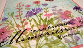
Inspired by Jacqueline

At Joy's blog, she's challenged us to choose a fellow stamper who inspires us and then make a card to honor her.  I didn't have to go far, just over to the Hero Arts Flickr pool to look at some of the cards I've saved as my favorites.  Again and again, since I started there, I've been inspired by Jacqueline, a sweet cardmaker who lives in France.  I could have chosen any of a hundred of her creations, but here is the one that spoke to me today:


Jacqueline has her very own style which I am always aspiring to reach.  She has a wonderful ability to put stamps together and make them a true work of art and she is so talented using distress inks.  Her work is so outstanding that she doesn't need to use lots of embellishments like many of us do; her compostions can always stand by themselves with little needing to be added, just an occasional butterfly or bird.  In studying her card, I couldn't think of anyting I'd do to improve it, so I decided to CASE it, just changing up the stamps used and brightening the colors a bit.


Like Jacqueline, I started with a white panel.  I stamped the Music Background using antique linen distress ink, and then smeared some broken china distress ink on a large acrylic block, spritzed it with lots of water, and then stamped it over the music.  After that had dried, I inked my Garden Bouquet with markers, spritzed it with water and then stamped - I LOVE the watercolor look this gives.  After that had dried thoroughly, I overstamped my sentiment, from the same set that Jacqueline used.  Lastly I framed the panel in pink, mounted it on a white card, and then just added some tiny butterflies and some sparkly gems.

supplies: white cardstock, antique linen and broken china distress inks, Hero Arts CG222 Music Background, CG172 Garden Bouquet, CL156 Treasure the Moments, CL383 Antique Engravings, Hero Hues Momento brush tip markers in Floral, Blush, and Foliage, pink and lavender gems

Thank you, Jacqueline, for your constant inspiration both in creativity but also in your faith, and also for sharing both of them with us.  I'm so glad to know you!

Please visit Jacqueline's blog and also her flickr photostream whenever you need some inspiration!

Friday, March 18, 2011

Flourishes Speed Challenge

I woke up this morning and found this Speed Challenge at the Flourishes Blog - have you seen this month's new releases?  I just had to try!  We are to use this sketch and get a card made by 10:00 am Central Time - I think I've done it!  Whew!!  Here is the sketch:


And here's my card.  I used mostly designer papers, given my almost 2 hours time constraint, except for the stamped flower and the sentiment.  I LOVE these aquas and yellows together!

Here's a detail picture:


supplies: cream cardstock, papers from October Afternoon Thrift Shop and Fly a Kite, BoBunny Buttercup Dot (for flower), Hero Arts CG291 Three Dotted Flowers, inked with versamark, embossed in white, and shaded with wild honey distress ink, CL131 SparkleClear Messages, poppy chalk ink, EK Success scallop edge punch, Nestabilities oval die-cut, ecru lace from Carole, aqua pearls from Virginia

Play Date Cafe challenge #73

Look at these colors that the Play Date Cafe has chosen for our challenge this week:


I found this die-cut that had all of these colors and used it as my start, then stamped all of the background panels and added some bits of lace.


supplies: cream, gold/orange, dusty pink and dusty purple cardstocks, K&Company Susan Winget Blossom Seed Packet die-cut, Hero Arts S4878 Old Letter Writing, E3373 Spring Memories, K5354 French Post, Impression Obsession WP25 Spring, Hero Arts latte chalk ink, bits of ecru lace from Carole

Thursday, March 17, 2011

A Cut Above

This is my second post for today, please scroll down to see the other one.  At the Flourishes Blog, the challenge is to use diecuts, border punches, anything that produces a cut edge:


My card uses some of my favorite diecuts and border punches, along with some die-cut Sizzix rolled roses that Suze sent me awhile back and another example of Susan Winget's beautiful art, the rose designer paper.   I let the beautiful papers speak, the sentiment being the only thing stamped here.


supplies: white cardstock, unknown yellow dotted paper, K&Company Susan Winget Spring Blossom Spring Mat Pad (rose paper), BoBunny reverse of flamingo double dot dp, Nestabilities oval and scallop oval diecuts, Martha Stewart doily border punch, Sizzix rolled rose dies, seam binding dyed with worn lipstick distress ink,  PTI Vintage Picnic Sentiments, versafine onyx black ink

CASE Study #31

Look at this card by Julee Tilman at this week's CASE Study:

I LOVE everything about her delicious card!  Hers is pure summer, but I went for spring, as I decided to use this Susan Winget Botanical dp as the basis for mine:


I am loving all the botanical papers that have been coming out this year, and was lucky enough to grab some of Susan Winget's and also some Grand Adhesions from her Spring Blossom collection, see detail below.  I hope this trend  continues for awhile, as these images just make me happy. 

I simply diecut the bird and nest paper, framed it with a dark brown, and placed that over the dotted blue paper.  I added some tiny white flowers centered with blue pearls and some of Donna's beautiful hand-dyed blue seam binding.  There really wasn't a good place for a sentiment. 


supplies: white cardstock, BoBunny double dot in a pale blue, K&Company Susan Winget Botanical die-cut mat pad, Core'dinations brown cardstock, Nesties Labels Four, Susan Winget Spring Blossom Bird Grand Adhesions, tiny white flowers, blue pearls from Virginia, seam-binding from Donna

Wednesday, March 16, 2011

Party Time?

Here's a second entry, a little more shabby, for this week's Shabby Tea Room Birthday Bash celebration: "Party Time".  Do you think these 2 had a little too much party?


A sweet friend recently sent me several of these older Stampa Rosa House Mouse stamps dated 1997, and this is the first inking of this one for me.  I colored it with colored pencils, making the cupcake like our oldest son David used to request his birthday cakes, with strawberry  or cherry icing.  To shabby it up a bit I added a doily cut in halves, some crinkled hand-dyed seam binding and a ribbon and button.  Since the coloring was pretty pastel, I used pale pink, blue and green to frame it out. 

supplies: white, pink and green cardstock, scrap of dotted blue dp, Stampa Rosa "Birthday Cupcake", Hero Arts CL272 All Occasion Messages, Prismacolor pencils, Donna's yellow seam binding ribbon, paper doily, button, white twine

Tuesday, March 15, 2011

Shabby Tea Room #53

Happy Anniversary to the Shabby Tea Room, which is having a Birthday Bash this week with a Birthday/Celebration theme.  My card is anything but shabby, but it does use some banners and lots of happy and I think it qualifies for the theme:


I used lots of new stamps, and did some paper-piecing using Cosmo Cricket dps. I wanted to use some sort of banner and decided to bring in this cute tree and birds to hang it on.

supplies: white cardstock, blue card base, kraft, green, pink and blue scraps for piecing, Cosmo Cricket scraps for banners, Hero Arts K5483 Tree Trunk, CL493 Life Life (sentiment), CL475 Friendly Flags (banners), CL439 Kiss from the Sun (sun), deNami notes stamp, tumbled glass distress ink for shading of sky

Also entering this into Hero Arts monthly challenge, which includes Birthday cards.

Monday, March 14, 2011

Aqua, blue and grey

What fun colors to work with!  Here is the inspiration picture for CR84FN's challenge #19:


And here is what I did with the colors:


I'm still loving making these stamped layered backrounds, so here is another incorporating the colors for the challenge.  I started with white paper, mooshed some weathered wood distress ink onto an acrylic block, spritzed with water and stamped over my white-embossed top-half of the Music Collage.  Then I overstamped the Magical Backiground using faded jeans distress ink, and the real violet 3 times using broken china distress ink.  This panel was then framed in aqua cardstock, layered over a panel each of grey and darker blue, stamped with the same Magical Background, and inserted a doily in between to bring out the white embossing.  The ribbon is from Donna, the pearls from Virginia - thanks ladies!

supplies: white, grey, aqua and blue cardstock, Hero Arts S5501 Musical Collage, CG211 Magical Background, CL430 Real Garden Petals, CLCL307 SparkleClear Mini Messages, weathered wood, broken china, faded jeans distress inks, versamark ink and white embossing powder, hand-dyed seam binding, aqua pearls, Martha Stewart monarch butterfly punch, white doily

Friday, March 11, 2011

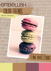
Embellish Color Trends and Music Challenge

Here are the fun colors we are to incorporate for the Embellish Blog's current challenge, and we are to also use music:


And at Flourishes, we are to use any kind of die cut, punch or decorative border:


Here is my take on them:


I REALLY love these colors together!  And I got to paper-piece these fun flowers, so I'm also entering this into the Moxie Fab World Paper Piecing Challenge.

Supplies: kraft cardstock, The Paper Studio music dp, various scraps of purple dot, pink tone-on-tone, pale yellow, and green papers, Hero Arts CL377 Be Happy, CL497 Find Joy, VersaFine onyx black ink, EK Success scallop edge punch

Play Date Cafe #72

Here is the inspiration for the challenge this week at the Play Date Cafe.  Really interesting mix of colors, don't you think?


Here is my submission.  I really loved the script and again, these colors were surprisingly fun to work with.


Can you stand another stab using Shari's stamped layered background?  That's where I started.  Here is a closeup of that stamped panel, showing the results of stamping using an acrylic block and distress ink misted with water, and also my subtle stamping of the allover heart pattern:


Supplies: white, BoBunny slate and blush dot cardstocks, Hero Arts S4878 Old Letter Writing, stamped in VersaMark and white embossed,  background made using spiced marmalade and worn lipstick distress inks, overstamped with HA H3786 Tiny Heart Pattern in worn lipstick, overstamped again with CL428 Earth Flowers stamped in chipped sapphire distress ink, sentiment CL497 Find Joy, flower CL374 Big and Small Flowers, orange button, pink embroidery floss