Saturday, April 30, 2011

CR84FN#26 and happy news!

I am so very excited to share with you that Mona Pendleton has asked me to be her guest designer for the month of May for her color challenge blog, CR84FN!  I am over the moon to be playing with Mona and the other members of her fabulous design team!!  Thank you, ladies!

Here are the colors we will be working with this week, and as a bonus, we're also celebrating Stephanie's birthday!


And here is my take on them:


supplies: kraft and white cardstock, yellow embossed and gold dotted dps (older scraps, sorry I can't identify them), BoBunny Mellow Yellow dot, (scalloped circle),  Papertrey Ink Vintage Picnic (basket and tulips) and Vintage Picnic Sentiments, versafine onyx black ink, Prisma colored pencils, Nesties circle and scalloped circle, paper doily, Martha Stewart butterfly punch, Wraphia bow, brown button, twine


Happy Birthday, Stephanie!  To see this week's cards made by the Design Team, please visit their gorgeous blogs:  Mona, Suzanne, DeborahHeather, Sue, Andrea, and Lisa.  I guarantee that you'll come away with inspiration overload!!  Thanks so much, ladies for allowing me to play with you this month!

Red. lime and grey at the Play Date Cafe!

Hey, that rhymes!!  Here is out inspiration for this week's challenge at The Play Date Cafe:


Challenging colors, for sure.  But once I found this Basic Grey dp, I decided to use all printed papers, and then it was just a matter of finding what looked good together.  Here is my entry for this week:

:
supplies: white cardstock, dps from October Afternoon "Modern Homemaker", "Beach Chair", and "Report Card", plus DCWV Mariposa, and Heidi Grace.  Background paper is from the Basic Grey Ambrosia paper pad, courtesy of my friend Donna, Hero Arts E3273 Hibiscus Style (flower), CG291 Three Dotted Flowers (leaves), and CL493 Live Life (sentiment), versafine onyx black and Adirondack Cranberry inks, tiny lime buttons

CASE Study #37

Here is Silke's card for us this week at CASE Study:


I loved the beautiful pink and white with all the girly pearls and lace border.  I remembered this lovely Verve set of stamps that I won from Stephanie awhile back:


supplies: pink shimmer and white cardstocks, BoBunny Passion Fruit and Avocado Dot, Verve "Believe" #VS-09-046, Hero Arts CG148 Blossoms (leaves), versafine onyx black ink, Martha Stewart Doily Punch, pink gingham ribbon, Nesties Labels Four, pink and white pearls


I'm also entering this into Simon Says Stamp "Anything Goes" challenge for this week and into Verve's April Showers Bring May Flowers challenge. 

Friday, April 29, 2011

Lily Pad Cards Inspirational Challenge

Hi!  Today I'm here to share a card I made for the inspirational challenge at Lily Pad Cards.  We are to choose something that we saw on the Lily Pad Cards blog and use it as our inspiration to make something new.

I was influenced by 2 different cards that we've seen recently on the Lily Pad blog.  This one was entered in our first Color Throw Down Challenge, and was made by Laura Bassen.  I loved the vibrant colors and how the lacy butterflies stood out against the plain white background.  Here is Laura's blog, Doublestick Heaven.  There are lots more beautiful cards there, many of them done in these clear bright colors.


And then there was this card by Joy Taylor, featured on Deborah's Wednesday Wonder column.  The pastels against the kraft and ivory just blew me away!  Of course, most of Joy's cards do that to me, but this one went right to my heart.  You can see more of Joy's work on her blog Less is More.


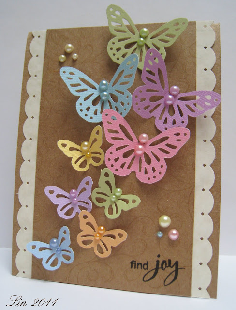
Thank you, Laura and Joy, for your inspiration!  Putting your 2 cards together, here is what I came up with:


I used Laura's lacy punched butterfly idea, and Joy's pastel color scheme.  And it seemed appropriate to use this sentiment, too.  Most of these beautiful pastel papers came from WalMart.

supplies: kraft and cream parchment card stocks and Colorbok textured pastel card stock, Martha Stewart large and medium Monarch Butterfly punches, EKSuccess  Scallop Diamond edge punch, a variety of colored pearls, Hero Arts CG119 Flourish Background, antique linen distress ink, CL497 Find Joy, versafine onyx black ink


I hope that you'll find something this week to inspire you, and play along with us!  There's a gift card from Simon Says Stamp up for grabs!!  Be sure to visit Lily Pad Cards for all the details, and to see what the other team members did at their blogs: Alice, Deborah, Nancy, Sherri, Suzanne, and Vicky.

I'd also like to enter this card into The Shabby Tea Room's Butterfly Wishes challenge.

Wednesday, April 27, 2011

CR84FN Red Aqua and White

I love the colors that Mona chose this week for our challenge at CR84FN!  Here is the color graphic:


One of the first things my eye went to was those white lattice chairs, which reminded me of my picket fence punch, and from there I went to something having to do with a garden. (surprise, surprise)   I haven't used this lovely Crafty Individuals poppy stamp in a long time, so I started with it.  For fun I stamped it over an October Afternoon printed paper, then paper-pieced the flower, colored in the leaves, and added the red grosgrain ribbon.  My panels are mostly CosmoCricket dps, chosen for their aqua and red color.  


supplies: white cardbae, Crafty Individuals C95.210L, October Afternoon Seaside "Beach Chair", Bo Bunny dotted paper, reversed to solid side, Cosmo Cricket dps, The Paper Studio red check dp, Martha Stewart picket fence punch,  Hero Arts sentiment from CL184 Thoughtful Messages, versafine onyx black ink, thin stitched grosgrain ribbon from Sue

Sunday, April 24, 2011

Lily Pad Card Digital Die Cut Challenge

Welcome to Lily Pad Cards' very first Digital Die Cut Challenge!!  I had a fun time playing with the die-cut file that Vicky has provided us, featuring a gardening theme.  Here it is, isn't it darling?  Vicky has graciously offered it to everyone - just get over to Lily Pad Cards to download it for free!


Though I don't have a Silhouette, since the file is available in jpeg and pdf,  I was still able to use Word to print out the files and cut them out by hand. I used Jen Martakis' "April" digital kit for the papers and flowers (keep reading for a chance to win that kit).  Here are 2 cards I made using them:


This card uses Vicky's picket fence die-cut file (enlarged a bit), Jen Martakis papers and fussy-cut daisies, a few stamps and punched butterflies.

supplies: white and gold cardstock, Jen Martakis papers and daisies, trimmed by hand, fence from Vicky's Gardening set, Hero Arts  CL374 Big and Small Flowers, (flower stems and leaves) versafine onyx black ink, green cardstock, CL184 Thoughtful Messages, Martha Stewart butterfly punch, yellow cardstock, embossed with Swiss Dots folder

And my second card used everything digital, (except for the hand-cut stems and leaves), even the sentiment is part of Jen's kit  The flower pots are shapes from Vicky's cut files.  I just used them as patterns on the back of the papers, and cut out the simple shapes by hand, then distressed the edges with a coordinating distress ink to give them definition.  I did the same with the edges of the flowers.


supplies: blue cardstock for card base, white cardstock to print out files from Jen Martakis "April" kit, scraps of green text dp for leaves and stems, Glossy Accents on centers of daisies, pots from Vicky's kit, sponged on edges with spun sugar and wild honey distress inks, Martha Stewart butterfly punch

I love the pretty pastel papers and the gardening elements in these kits!  I hope I've shown you that you don't need to have a Silhouette or other die-cut machine in order to play with us in our digital challenge this week.  Please give it a try!  For more inspiration, visit the Lily Pad Cards Blog to see some examples from the digital team: Pia, Latrice, and Sarah, and to get your free digital kit!  The challenge will last a whole month, and you can enter as many times as you like, using whatever colors or theme you'd like.  The winner will receive this Jen Martakis "April" kit:


Can't wait to see what you come up with!

Also entering my first card into Verve Stamps "April Showers Bring May Flowers" contest.

Friday, April 22, 2011

CASE Study #36

If you are here to see my card for Lucy's sketch at Lily Pad Cards, please scroll down one post - thanks!

Here is the beautiful card made by this month's muse, Silke Ledlow for this week's CASE Study:


I really like the layout of this card and how all of the elements were placed, so I followed suit with my card:


I also used a Flourish stamp, one of my favorites, from the Violets set.  Violets are a sure sign of spring for me, and these colors are some of my very favorites, a periwinkle blue and a limey green.

supplies: white and periwinkle cardstock, BoBunny mint dot, Flourishes violets, stamped on shiny paper and watercolored using Marvy markers and water, cut out and glued back onto an oval diecut from Nesties, Cuttlebug D'vine Swirl on periwinkle panel, PTI Vintage Picnic Sentiments, Hero Arts CL383 Antique Engravings (dragonfly), versafine onyx black ink, blue pearls, lime and periwinkle ribbon, old button


I'm also entering this into Verve's April Diva Dare: "April Showers Bring May Flowers" contest, and for the challenge at Really Reasonable Ribbon's Ramblings "Violets & Lilacs & Plums, Oh My!".

Lucy's Fine Lines challenge

Good morning!  I'm here today with my card made for Lucy's sketch challenge at the Lily Pad Cards Blog.  Here is the sketch Lucy gave us to work with: 
And here's my card.  


supplies: Penny Black cardstock #12 purple mountain, all 3 shades, Penny Black stamps #30-067 To You, versafine onyx black ink, Prismacolor pencils and Hero Hues markers for shading, and #40-048 Paisley Outline, dusty concord distress ink


Be sure to visit the other Dream Team members to see their ideas for this sketch:  Alice Wertz, Deborah Nolan, Nancy Krueger, Sherri Thompson, Suzanne Czosek, and Vicky Papaioannou.  And I can't wait to see what you do with it!  The winner gets a prize package from Penny Black stamps!

Thursday, April 21, 2011

Red, blue and pink

Here are our colors for this week's Play Date Cafe Challenge:


I was so excited to see these colors, primarily because I just got some Girls Paperie papers and these colors fit the challenge exactly, I think.  Here is my card for this week:


supplies: off-white cardstock for base, Girls Paperie dp and and unknown scrap of dotted blue dp, red, blue, pink cardstock, Die-namics rolled rose dies,  stamped leaves from my scrapbasket.  tiny white zig-zag trim, off-white crochet lace, PTI "Embellishments" (sentiments), versafine onyx black ink

Tuesday, April 19, 2011

Clean and Simple

I found a new shopping site recently (got some really lovely 6" paper pads and fantastic service!) and with it a new challenge site, too: Claudia & Company.  Their challenge #80 is Clean and Simple.  We all know that this is a real challenge for me, as I love to layer on as much as I can fit on a card lately, but this style is one I need to learn to do, so here is my entry:


I knew I wanted to do something with lots of clean space and my eyes lit on my silhouette stamps.  You know me, I had to get a little bit of pattern in there, so I chose my favorite music paper, which is a creamy tone and black.   There was my palette, and I even had a sentiment that went with it.  

supplies: cream and black cardstock, The Paper Studio "Textured Cream Sheet Music", versafine onyx black ink and clear embossing powder, Hero Arts CG271 Large Blossom, CL342 Everyday Sayings 

Variations on a theme

One of our challenges this month at the Hero Arts Blog is to make masculine projects.  Why do masculine cards seem so difficult?  I recently found this pretty striped paper from My Mind's Eye at Hobby Lobby and now I wish I'd bought several sheets of it!  I decided to play with it last night and here is a set of masculine cards that resulted, all of them using the Three Ferns stamp, embossed in Verdigris powder, which is primarily green, but has flecks of brown and gold in it:


supplies: kraft, dark and medium aqua, wheat cardstock, My Mind's Eye "Four Miles Stripe" design paper, Hero Arts stamps S5154 Three Ferns, versamark ink and Ranger Antiquities Verdigris embosssing powder, CG125 Friend Definition, CL267 Card Messages, Versafine Deep Lagoon ink, K5354 French Post, Memories art print brown ink, CL497 Find Joy, S4878 Old Letter Writing, CL494 Hip Hip Hooray!, wheat twine, buttons

Monday, April 18, 2011

Happy Spring

Here are the lovely colors that Mona has chosen for us this week at CR84FN.  These aquamarine colors are probably some of my favorites at this time of year.


Here is what I made for this week:


The smaller print paper is from My Mind's Eye Stella & Rose "Hazel" pad, and the bigger print is a resized digital paper.  When I resized it from a square to a rectangle in Word, the polka dots became polka eggs, and off I went on my bird theme! The central panel is a piece of graph paper from K&Company's Brenda Walton Flora & Fauna Ledger Pad; I chose the top of one of them that had this egg printed on it.   The bird is a from Stampin' Up set called Touch of Nature, borrowed from my friend Carol.  I threaded some blue and white baker's twine through the holes at the top and tied a double bow at the end.  To finish I added some pearls and the sentiment.  This sketch is from Julee Tilman when she was a guest designer at CASE Study last month; I just turned it 90 degrees.

supplies: cream parchment and aqua cardstock, "Hazel" paper pad from Stella & Rose, digital paper from Verena Karolyi "Loving Mommy" papers, K&Company Brenda Walton "Flora & Fauna" paper pad, Stampin' Up Touch of Nature, prismacolor pencils,  PTI Friendship Jar Spring Fillers (sentiment), Memories art print brown ink, Jillibean Soup twine, Hero Arts CH231 Lace Ribbon, aqua pearls, nesties labels four and scalloped ovals

Violets & Lilacs & Plums, Oh My!

At Really Reasonable Ribbons blog, our challenge is to use any shade of purple, and a ribbon, of course!


I am definitely purple-challenged, having very little of anything in my stash.   Must go back to my college days when my (local) sorority's colors were lavender and grey........we had to wear it once a week, and it's taken all this time for me to like the color again!  My ribbon here is a piece of white organdy ribbon which I dyed using Memories Soft Lilac ink, and then another swipe of Memories Baby Pink, to take away some of the blueness and make it more lilac-colored to match the flower and background paper.

supplies: white and lilac cardstock, Whispers 6 squares shadow stamp, Memories Soft Lilac ink,  Hero Arts S5376 Hydrangea, watercolor pencils, PTI Friendship Jar Spring Fillers (sentiment), versafine onyx black ink, scrap of unknown harlequin pattern dp, paper doily, hand-dyed ribbon, Memories Baby Pink ink, EKSuccess scallop border punch

Sunday, April 17, 2011

"No Coloring" challenge

At Our Daily Bread Designs Shining the Light this week our challenge is to make something without coloring it.  I  used colored inks and patterned papers for my entry:


This uses a real mix of stamps and products from several companies.  From Our Daily Bread comes the quote from Ecclesiastes: "To every thing there is a season....", stamped over the egg-patterned paper from K&Company.  The main image, a Crafty Individuals bird image,  was stamped in Hero Hues cerulean chalk ink.  And the sentiment is a new one from Flourishes Lenten Rose set.  The other printed paper is from My Mind's Eye Stella & Rose "Gertie" paper pad, and the lovely toile-like flower is from the Recollections line at Michaels.

supplies:  pale aqua, ivory parchment and kraft cardstocks, Magenta Crafty Individuals #95205M, Our Daily Bread "Randi's Song", Flourishes "Lenten Rose", Hero Hues cerulean chalk ink, Memories art print brown ink, K&Company Susan Winget Botanical Die Cut Mat Pad, My Mind's Eye Stella & Rose "Gertie" paper pad, Hero Arts CH231 Lace Ribbon, Recollections "Boutique Fleur"

Hero Arts Spring/Easter card exchange

Over at the Hero Arts flickr group, Anita organized us into a card exchange with the theme of Spring or Easter.  I received my card on Friday from Sheila.  Here it is in all of it's gorgeousness!


Spring is bursting out all over this beauty!  Love the gorgeous magnolia - don't we wish they came in this color?  And the beautiful mix of printed papers shows it off perfectly!  Thanks, Sheila!  Love it!  If you'd like to see more of Sheila's work, hop on over to her new blog Color Me Happy.

Here's the card I made for Sharon, using some new PTI goodies:


supplies: white and pink cardstock, unknown yellow dotted paper, Paper Trey Ink Friendship Jar and Friendship Jar Spring, versafine onyx black ink, colored pencils, white twine

Saturday, April 16, 2011

Play Date Cafe challenge #77

Here are our inspiration colors this week at the Play Date Cafe Challenge:


I saw that green and brown and I went right to this sweet bunny stamp I just received:


The image was stamped, colored with pencils, fussy-cut and then glued to a digital paper which I resized to make a frame.  Then I just framed out that image, adding a doily and a white ribbon to bring in more of the white color, as it is pretty predominant in our inspiration photos.

supplies: white and kraft cardstock, Flourishes "Spring is Sprung", Paper Trey Ink "Friendship Jar Spring Fillers" (sentiment), versafine onyx black ink, Prismacolor pencils, digital paper from Apple Blossom May free kit by Tia Bennett (Two Peas in a Bucket), DCWV "embossed green dots" dp,  white ribbon (Hobby Lobby)

Vintage print

Here is Silke Ledlow's card for this week's challenge at CASE Study:

The word "vintage" was mentioned in the description, and that's where my mind went.  I searched my saved images for something vintage, and found this print by Jessie Wilcox Smith, one of my very favorite children's book illustrators.  So that was the basis for my card.  I pulled all of the colors from this image, and used Silke's sketch to put everything together..  


supplies: cream card base, design papers from My Mind's Eye Stella & Rose Mabel paper pad and October Afternoon Fly a Kite pad, computer image by Jessie Wilcox Smith, PTI Embellishments for sentiment (love the font), versafine onyx black ink, periwinkle ribbon, lace from Carole, old button, flower brads, pale aqua pearls

Here is a closeup of the sweet little girl, showing her beautiful face and more of the details.  I pulled the ribbon color from the flowers in her basket.

Friday, April 15, 2011

Flourishes Speed Challenge

If you're here to see my Globecraft Memories cards from Lily Pad Cards, please scroll down one post.

Here is the sketch we are to use for the Flourishes Speed Challenge - fast paced, heart racing, get those creative juices pumping kind of challenge - they got that right!!

And here is my entry.  I got to use this sweet little bird and flowers from a Flourishes set I won last month:


supplies: white and green cardstock, Flourishes Spring Has Sprung, versamark onyx black ink, colored pencils, dps from Stella & Rose Mabel and Gertie paper pads, green dotted ribbon, aqua button, gold pearls
:

Globecraft Memories

Hello!  Today I'm excited to show you some examples of a brand new idea from a company called Globecraft Memories!  Basically, you get a plastic dome and several die-cut frames to go around it, which you can paint and/or stamp on directly or cover with papers, as I've done with mine.  They even include a little diecut easel to place on the back of your creation to help display it!  There are 6 different configurations of frames in 2 sizes each, so the possibilities are endless!  The more I played, the more ideas came, so I'm sharing 3 examples today, all done in the same color scheme (Barb, these are for you!).   Here's my first:


supplies: white cardstock stamped several times with "Spring" from Hero Arts LL007 Seasonal Memories, peeled paint distress ink, various scraps of dps for frames, Hero Arts CL377 Be Happy for flower, grass, bees and sentiment, stamped in versamark onyx black ink on various scraps of dots, checks, and solids, white twine, pink pearls

And a detail shot to show you the dome, and that I popped several elements above the image with lots of room to spare under the dome:


Here's another one I made using the same configuration of diecut frames, just turned 90 degrees, and a favorite old stamp:


supplies: white cardstock, Hero Arts E3020 Sketch Tulips, stamped twice with versafine onyx black ink, watercolored, and then the flowers cut out and popped above the image, various dps, tiny buttons, pink organza ribbon

And one more, using another configuration.  These globes are wonderful to protect anything delicate, like these die-cut rolled roses that I used for this card.  Please excuse the glare; the domes really catch the light:


supplies: K&Company rose print paper from Susan Winget's Spring Blossom mat pad, Die-namics (mftstamps) rolled rose die-cuts, punched ferns/leaves, white lace, pink button, pink pearls

And another detailed shot:


For even more examples, see today's Lily Pad Cards post.  In order to join the challenge, you don't need to have these Globecraft dome products; just use a frame or a die-cut and some pop-dots to make your creation dimensional.

Thursday, April 14, 2011

CR84FN challenge #23

Here's another card for CR84FN's challenge this week, using light pink, black and cream:


supplies: pink, black and cream cardstocks, papers from The Paper Studio (music), foof-a-La (swirls), and My Mind's Eye "Lost & Found" (pink paisley), Penny Black 4037K Mixed Media, versafine onyx black ink and clear embossing powder, pink marker, PTI Embellishments (sentiment), spun sugar distress ink on edges,  Martha Stewart Monarch butterfly punch, pink pearls, ecru lace, pink ribbon

I just got this Penny Black collage stamp and thought it would be perfect for this challenge.  It was embossed in black and then I just colored in the poppies in a pale pink marker.  Added some dps, lace, pearls, ribbon, a punched butterfly, and the sentiment.  I'll also be entering this into Penny Black's flowers challenge.  

Here's the inspiration picture for the challenge - beautiful colors, don't you think?


Wednesday, April 13, 2011

Spring Flowers

 Hi, all, I took a little stroll around the house just now and thought I'd share a few flowers that are blooming in our gardens......things are pretty sparse right now, but I can see lots of green starting to peak through the soil.  I decided to bring a tiny bouquet inside with me.  These are miniature daffodils, maybe called tete-a-tete, along with the gorgeous blue scilla, and I think the white ones are wood hyacinths - they grow on separate little stems instead of a big flower cluster like regular hyacinths.  All of them are bulbs.   The daffodils, I think, are emitting a slight fragrance


Here's another picture with my nest that I cherish, filled with old robin's eggs or pieces of them.   Every spring I scout around the big blue spruces in back and often find discarded eggs.  The nest is, we think, a hummingbird one that my Dad found one year, made of horsehair (he lives adjacent to a barn housing horses).


Enjoy!

Tuesday, April 12, 2011

Tuesday Trigger

Do you not LOVE this inspiration photo for this week's Moxie Fab World Tuesday Trigger?  Cath entitled it "Porch Play".  


I adore this little scene.  I would never have the courage to put these colors together in my home, but that didn't stop me from reconstructing it on a card!


As soon as I saw that gorgeous red mirror in the inspiration photo, I remembered this frilly oval frame that I was recently given by a special friend.  Then I just pulled the colors and some of the elements out of the inspiration: gerbera daisy, flower pot, turquoise fabrics, zig-zag trim.  I also scored the background of the card to resemble a panelled wall.

supplies: white, red, and green cardstock, dps from Stella & Rose Hazel paper pad and October Afternoon The Thrift Shop pad, Penny Black 303K Ruffle Frame, Hero Arts CL374 Big and Small Flowers, CL377 Be Happy (stem and leaves), CL493 Live Life, versafine onyx black ink, gardening cut-file from Vicky, white zig-zag trim